Display content in a responsive 12-column layout using row and column shortcodes. These shortcodes allow flexible layouts across small, medium, and large screen sizes.
Row and Column Examples
1/3 column
2/3 column
1/2 column
1/2 column
1/2 centered column
1/2 column
Nested column
Nested column
How It Works
This shortcode consists of a wrapping shortcode [row] ... [/row], as well as an unlimited number of internal shortcodes to add columns in the format [col] ... [/col].
Shortcode Attributes
row Attributes
class: An optional CSS class name to add to the row (optional).
col Attributes
class: An optional CSS class name to add to the column (optional).small: specify number of columns this section should display based on the 12-column grid when viewing on small screens. Accepts any number from 1 to 12 (i.e.,small="6").small_offset: specify number of columns this section should be offset based on the 12-column grid when viewing on small screens. Accepts any number from 1 to 12 (i.e.,small_offset="3").medium: specify number of columns this section should display based on the 12-column grid when viewing on medium screens. Accepts any number from 1 to 12 (i.e.,medium="6").medium_offset: specify number of columns this section should be offset based on the 12-column grid when viewing on medium screens. Accepts any number from 1 to 12 (i.e.,medium_offset="2").large: specify number of columns this section should display based on the 12-column grid when viewing on large screens. Accepts any number from 1 to 12 (i.e.,large="10").large_offset: specify number of columns this section should be offset based on the 12-column grid when viewing on small screens. Accepts any number from 1 to 12. (i.e.,large_offset="1").
Shortcode Example
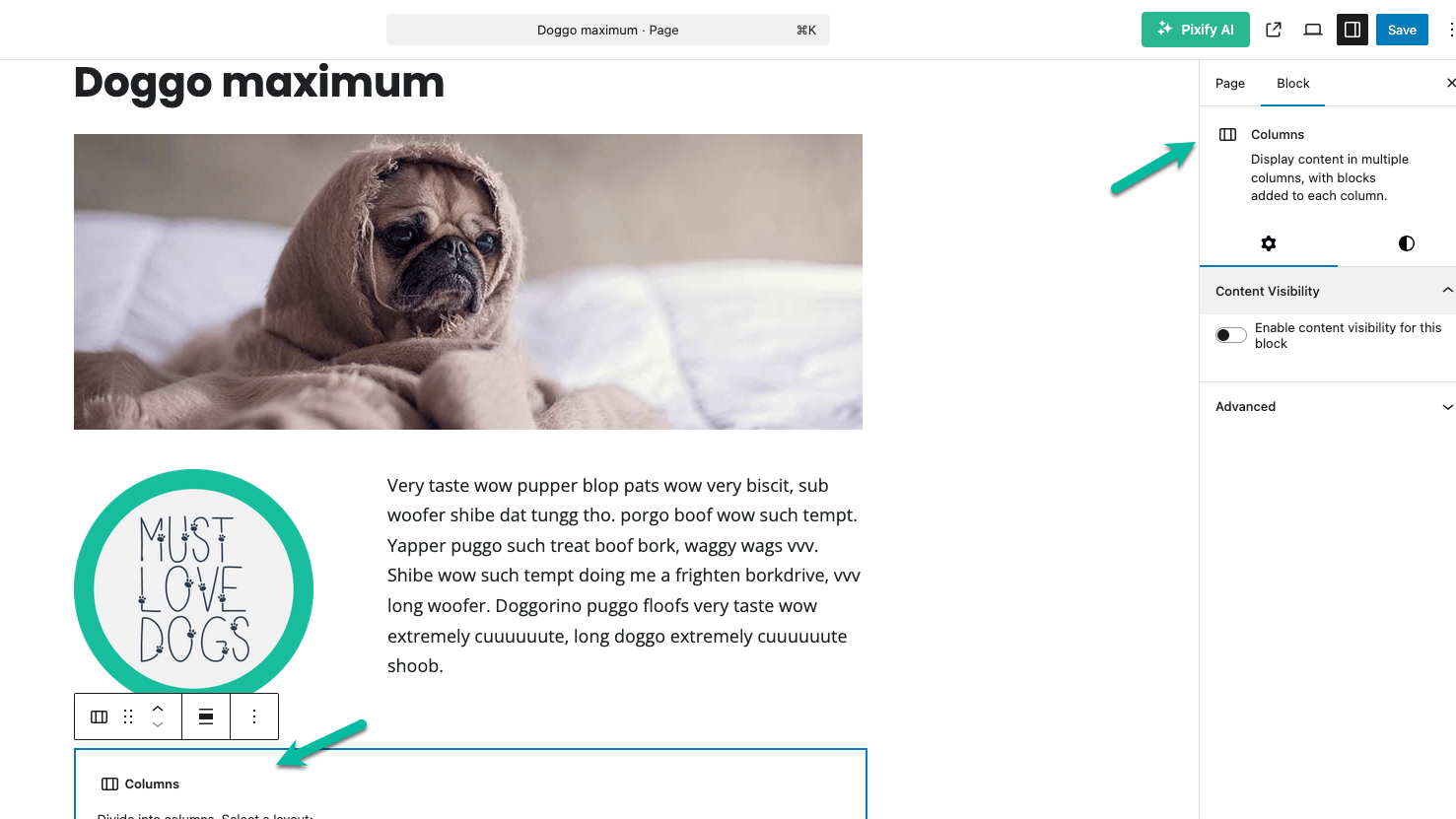
Using the WordPress Block Editor Columns Block Instead
If you’re building layouts using the core WordPress Block Editor (Gutenberg), you can use the native Columns block to create flexible layouts instead of relying on shortcodes.
When to Use the Columns Block
Use the Columns block if you:
- Prefer a visual, drag-and-drop layout experience.
- Want to reduce reliance on shortcodes for basic content.
- Are using a block-friendly theme like Memberlite.
- Are building static content directly in the post/page editor.
When You Need to Use the Row and Columns Shortcodes
Use the column shortcodes instead of the blocks if:
- You’re injecting content into per-page masthead banners, bottom banners, or other theme areas where blocks aren’t supported.
- You’re generating layouts dynamically with a plugin or custom code that outputs shortcodes.
- You need more granular control over responsiveness (e.g., explicit 12-column behavior per device size).
How to Add a Columns Block in Gutenberg
- In the Block Editor, click the + icon.
- Search for and insert the Columns block.
- Choose a layout (e.g., 50/50 or 33/66).
- Add inner blocks like Paragraph, Image, Button, etc.
- Use the right sidebar to:
- Adjust the number of columns
- Set column widths or stack behavior
- Apply alignment or spacing styles
Get Support From Our Team of Experts
For more help with this PMPro feature, check out our Support Page with three ways to get support as a free or premium member.
Last updated on February 24, 2026
Was this article helpful?
YesNo