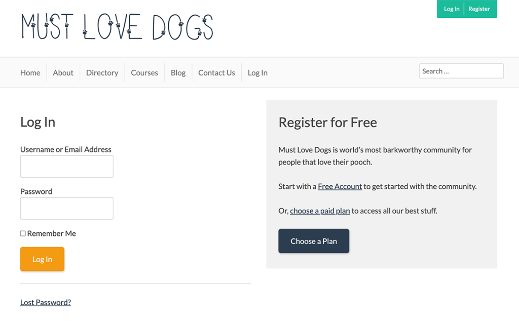
Your membership site’s login page gets a ton of traffic—not only for people trying to log in to their existing account but also for non-members who happen upon this page while browsing premium content.
Depending on how you protect access in your membership site, people may be redirected to this page in their normal browsing patterns, too.
With all this traffic, we wanted to give you a tutorial on how to make this page work a little harder for you and your business goals. Here’s a creative way to make this basic login page do more than just its sole purpose of allowing your members to sign in.
This code recipe gives you the drop-in content for the WordPress Block Editor to make your login page have a dual purpose: add a small ad block on your login page that includes a link to registration and some benefits of becoming a member.

Highlight The Benefits of Registration
You can get super creative or keep things really straightforward for a dual login and register page. Some example content to put in your registration block include:
- A link to your free membership level checkout
- A brief description of your paid membership level that links to checkout
- An overview of membership benefits that links to your membership pricing page

The Page Content (WordPress Block Editor)
Show Combined Login and Registration Page
Adding the Content to Your Website
This code is designed in the WordPress Block Editor. You can copy and paste the block of content in the recipe right into the “Code Editor” view.
- Navigate to Memberships > Settings > Pages.
- Edit the “Log In” page.
- In the WordPress Editor, toggle to the “Code Editor” view by click the three dots icon in the top right of your screen, then select “Code Editor“. You can also use the keyboard shortcut ⇧⌥⌘M to access this view.
- Now, replace the contents of your Log In page with the content from the snippet above.
You can toggle out of the editor view by clicking the “Exit code editor” link near the title of your page.
Once you’re happy with the edits, click Update to publish your changes.
If you use another editor, you can follow the steps in this guide to create a similar dual purpose login page using your favorite page builder like Elementor, Divi, or Beaver Builder.
FAQ: Combined Login and Registration Page Design
A combined login and registration page integrates both functionalities into a single, user-friendly interface, allowing new users to register and existing users to log in from the same page, thereby streamlining the user experience.
A combined page that offers both the login form and a link to your membership pricing page reduces confusion and streamlines the navigation process. This effort has the power to increase user retention and conversion rates.
Prioritize simplicity and clarity in the design. Clearly differentiate between login and registration sections, use concise and clear language, and ensure the form is easy to navigate and interact with on various devices.
Best practices include using a responsive design, minimizing the amount of marketing copy in your registration callout block, providing clear error messages, and ensuring quick load times. You can even consider adding social login options to simplify the process further.
Absolutely! It’s important to align the design of your login and registration page with your brand’s visual identity. Customize colors, fonts, and logos to provide a consistent user experience across your site.
Yes, with the increasing prevalence of mobile internet usage, ensuring your page is optimized for mobile devices is crucial for reaching a broader audience and providing a positive user experience.
Highlight the benefits of registration, such as access to exclusive content or community features, provide a simple and quick registration process, and consider offering incentives like discounts or free content for new members.
Look at other successful membership sites, especially those in your industry, for design ideas. UX design websites, web design blogs, and platforms like Behance and Dribbble can also provide inspiration and best practices.
Related Reading: How to Customize the Frontend Pages
We have a few articles in our blog on how to adjust the appearance of your frontend membership pages. Check the links below to explore the guides:
- Making a Powerful Member Dashboard for Your Membership Account Page
- Create a Dual Login and Benefits of Registration Page
- How to Create a Custom Membership Level Pricing Page
- Membership Pricing Pages and Streamlining the Checkout Process
- Using Page Builders to Enhance Your Site’s Membership Pages
- Design a Specific Level’s Membership Checkout Page Using CSS
- Customizing the Member Links list on Membership Account Page
- Add Links by Membership Level to the Membership Account Page “links” Section
- Customizing the Member Cancellation Process
- How to Load a Custom Template for Membership Pages or System-Generated Emails


